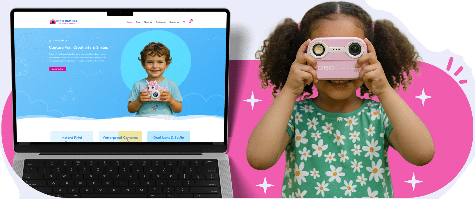
Kids’ Camera is a New Zealand online shop selling digital cameras and accessories. This project presents the storefront, product-page layouts and visual styling developed for the range.
WORKFLOW & PROCESS
A Structured Workflow That Ensures Quality at Every Step
We followed a clear, step-by-step process to design, build, and refine the Kids’ Camera website with precision and consistency.
Research & Planning
Reviewed brand style, product range, user behaviour, and the existing structure to define
a clear direction.
Wireframes
Mapped out page layouts, navigation flow, and category organisation to establish foundation
and structure.
Visual Design
Created the playful UI theme using soft shapes, warm colours, rounded elements,
and clean typography.
Development
Built the site in a modular and scalable way with WooCommerce integration and optimised components.
Testing
Tested responsiveness, speed,
product browsing, and overall usability
across multiple devices.
Iterations
Refined product cards, spacing, readability, and page balance for a
polished final experience.
Performance Enhancements
Optimised visuals, code and responsiveness
Site Performance & Speed Optimisation
Layouts for Phone and Desktop
The storefront combines product imagery, product information and navigation in layouts designed for phone and desktop. This case study does not present measured before-and-after speed results.
The project connects product browsing, available options and shopping calls to action within the storefront design.
Clear Product Showcase
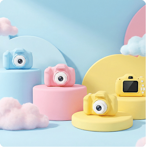
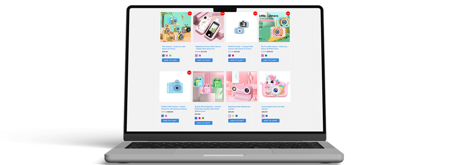
We structured the homepage and shop layout to display products in a clean, organised format with consistent imagery, colours, and labels.
Smooth Flow
The entire purchasing journey was redesigned to guide users naturally through browsing, selecting variations, and adding items to the cart without confusion.
Delivered Experience
Product pages present images, options and shopping controls within a consistent layout. Current checkout, payment and fulfilment behaviour require separate operational testing.
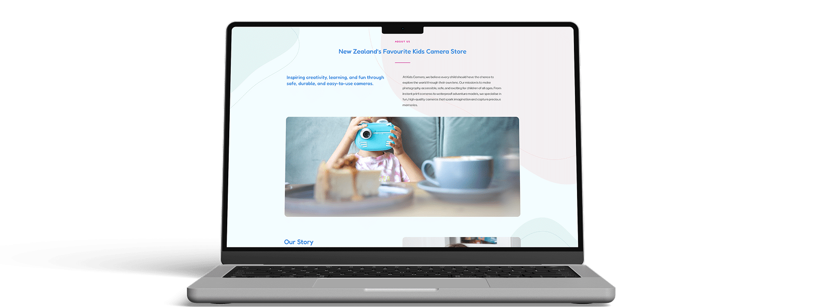
About Page Section
We created a clean, structured About Page that introduces the brand in a friendly, easy-to-read format. The design uses large imagery, soft shapes, and clear typography to maintain consistency with the rest of the site.
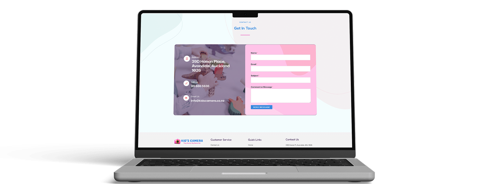
Contact Page
We designed a simple and functional contact page with a clear form, highlighted address block,
and responsive styling.
Shop Page
The page balances visual space while keeping communication easy for customers.
RESULTS
Storefront Features Delivered
The project applies consistent typography, colours and product-page layouts across the storefront.
Improved User Navigation
Product cards and navigation organise the range for browsing.
Product Page Structure
Product imagery and information are arranged within phone and desktop layouts.
Consistent Visual Flow
Product cards, colours, and UI elements appear unified across every page.
Simplified Buying Journey
Shopping calls to action are placed alongside product information and available options.
About NO BRAINER TEAM
No Brainer is a team of passionate creators,
thinkers and innovators